responsive webdesign
Responsive web design is responsive web design that reacts to different screen sizes and resolutions. Since display sizes and screen resolutions of mobile devices are completely different, websites need to be redesigned when they are displayed on smartphones, tablets or notebooks.
Scaling the display size is not enough because devices have different aspect ratios and cannot convert web pages 1:1. The number of columns and the arrangement of content, navigation lines and banners must be adapted to the smaller screens. Responsive web design takes care of this flexible optimization. It adapts the website to the display capabilities of the end device used - desktop, laptop, notebook, tablet, smartphone. The layout of the smaller website can be fundamentally different from the larger one.
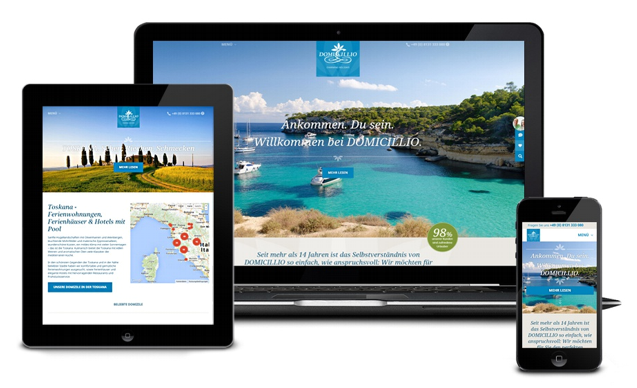
The advantage of Responsive web design is the low maintenance. In non-responsive websites, the content, graphics, images and navigation must be maintained for each format. The tools available for Responsive Web Design are HTML5 and Cascading Style Sheets (CSS3).